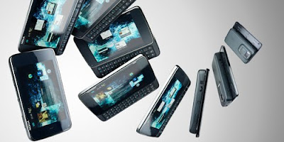
Nokia N900 review

Having released a series of solid, but unexciting handsets in the last couple of years and seen the HTC Hero, Pre and (particularly) the Apple iPhone 3GS, grab market share and the tech lovers’ imagination, Nokia needs a big handset success and fast. The N900 eschews Symbian for the open-source Maemo 5 OS and despite a few gripes; it’s the best handset Nokia has produced in a long time.
At 18mm deep, the N900 is chunkier than you’d expect, but feels solid and well built. There are no buttons on top, the 3.5-inch screen slides back to reveal an excellent full QWERTY keyboard. One thing you’ll notice straight away is that with the exception of making calls, it only works in landscape mode, making it near impossible to operate one-handed, potentially putting some people off.
Marvellous Maemo
Maemo 5 is based around open source Linux technology, which means developers are free to create apps for it. Intuitive and flexible, it makes Symbian look antiquated. Swipe through four home screens, each fully customisable with website shortcuts, RSS feeds, applications (that update live), contacts and shortcuts to your address book, calendar, web etc. You could have one home screen for work, one for your personal life and one for all your favourite web links.
Open applications and web pages appear as tabs on the virtual ‘dashboard’ screen, which sits between the menu and home screens, here you can swap between different programs and shut them down. Phone settings are accessed through the applications menu. The resistive touchscreen is a bit unresponsive; a quick touch activates commands, but press too hard and nothing happens. This could be because we had an early sample, but at the moment it’s not as responsive as the iPhone or the Palm Pre.
Crucially, a major issue we’ve got with the N900 is that it’s not obvious when you’ve received a message. If you miss the message bubble, the indicator light flashes and the corner button glows, but only when you click through to the dashboard can you find out who the message is from. It really needs information displayed on the lock screen like the new Windows 6.5 handsets.
Screen dream?
With a resolution of 800x480 the screen is fantastic. It’s bright, colourful and sharp and Flash 9.4 support lets you play back You Tube clips, although we noticed slight juddering and lag when playing back a video from T3.com. The Mozilla powered browser is excellent, displaying full web pages and loading T3.com in about six seconds.
Scroll by moving your finger around the page, alternatively dragging onto the screen from the left introduces a movable navigation arrow, this isn’t something we’d use, but it’s a useful alternative to the stylus when navigating websites. Zoom in and out by double tapping, or via the volume control, although this last method does leave you unable to adjust the sound when listening to music. It’s all very simple, but we found the iPhone’s multi-touch gestures more intuitive.
The ARM Cortex-A8 processor, coupled with a generous 1GB RAM means you can run multiple applications simultaneously. We swapped between the music player, a You Tube Video, multiple web pages, the camera and various contacts and message folders, without any of the sluggishness you get from other handsets. Although after 24-hours of moderate calling and texting, WiFi continually on, some browsing and photography, we needed to recharge. Cane the web and you’ll need to carry a charger around with you.
Apps will also be available from Ovi Store for Maemo 5 when it launches, as well as developer portal Maemo Select which has 50 apps including FaceBook for Nokia and Amazon.
It's all about the networking
The N900 supports a host of IM services, including: Ovi by Nokia, Skype, Google Talk, Jabber and SIP. Messages are displayed alongside SMS’s in the ‘Conversations’ tab and it’s very simple to synch contact information across programs. Push email is a cinch to set-up too, but is separate. It would have been useful to have them both - along with Tweets and Facebook messages - in one central place, like Motorola’s MotoBlur interface. Although the beauty of Maemo is that an app could rectify this.
There’s no support for MMS’s, because Nokia says the N900 is a ‘computing/imaging solution.’ This is a little short-sighted; for many people the N900 will be their primary telephone. Crucially, a major issue we’ve got with the N900 is that it’s not obvious when you’ve received a message. If you miss the message bubble, the indicator light flashes but there’s nothing on the home screen - only when you click through to the dashboard do you read it. The keys glow, but you’ve got to have the handset open. It could do with information displayed on the lock screen like the new Windows 6.5 handsets.
Mammoth memory
With 32GB of internal storage there’s plenty of room for music and photos. Pictures taken with the 5MP camera are fine and are geotagged, but with an LED instead of Xenon flash, it just isn’t as good as the Sony Ericsson Satio. Surprisingly you can’t access pictures via the Media Player (which isn’t as good as Sony’s Xross Media Bar), just videos, internet radio and music. Ovi maps are supplied, but they’re no match for dedicated sat nav software.
With a customisable interface, great multimedia features and capable browser, the N900 is far better than any Nokia handset we’ve seen in along time. In terms of browsing and sheer multitasking capability, it’s also superior to other smartphone rivals. Yes, we’re going to use the term smartphone, whatever Nokia says.
****
Comments
Post a Comment